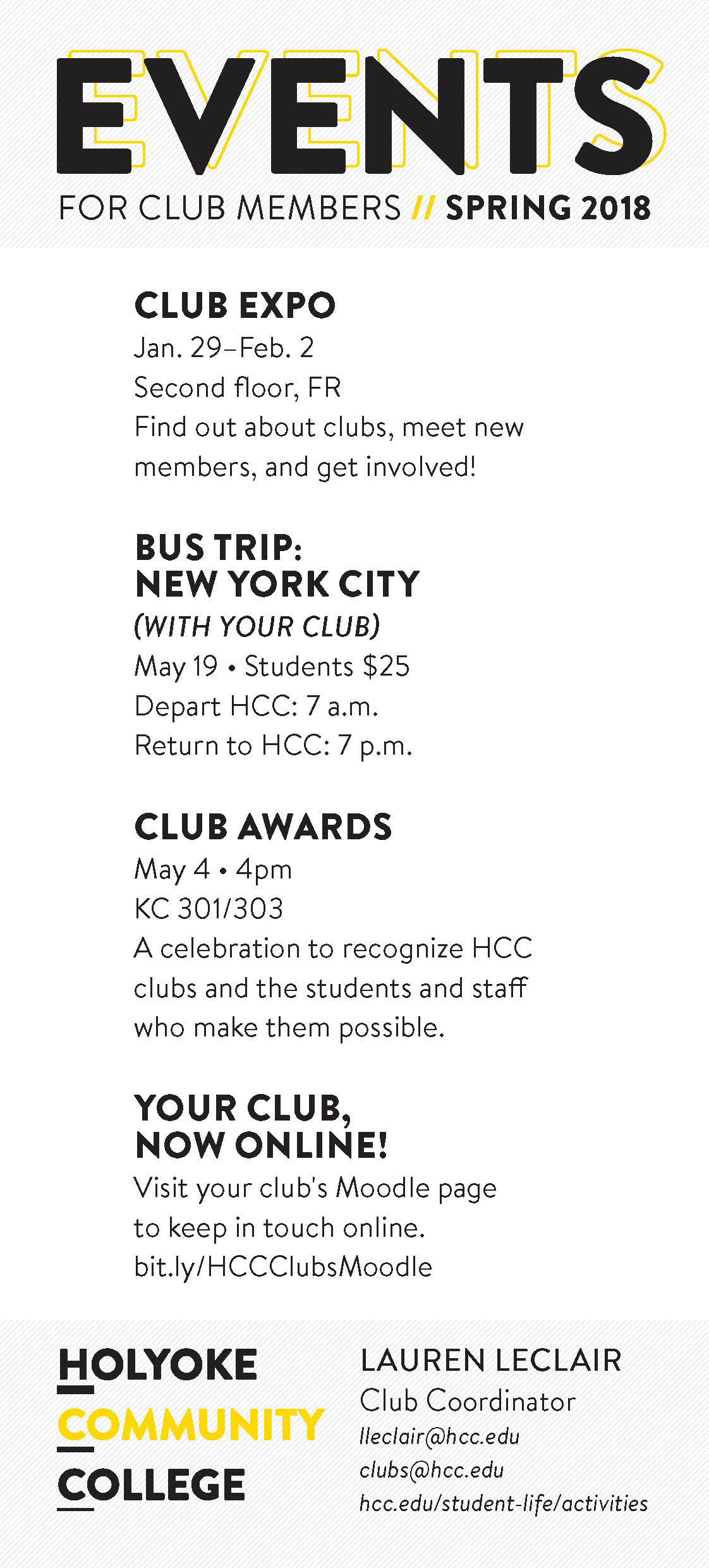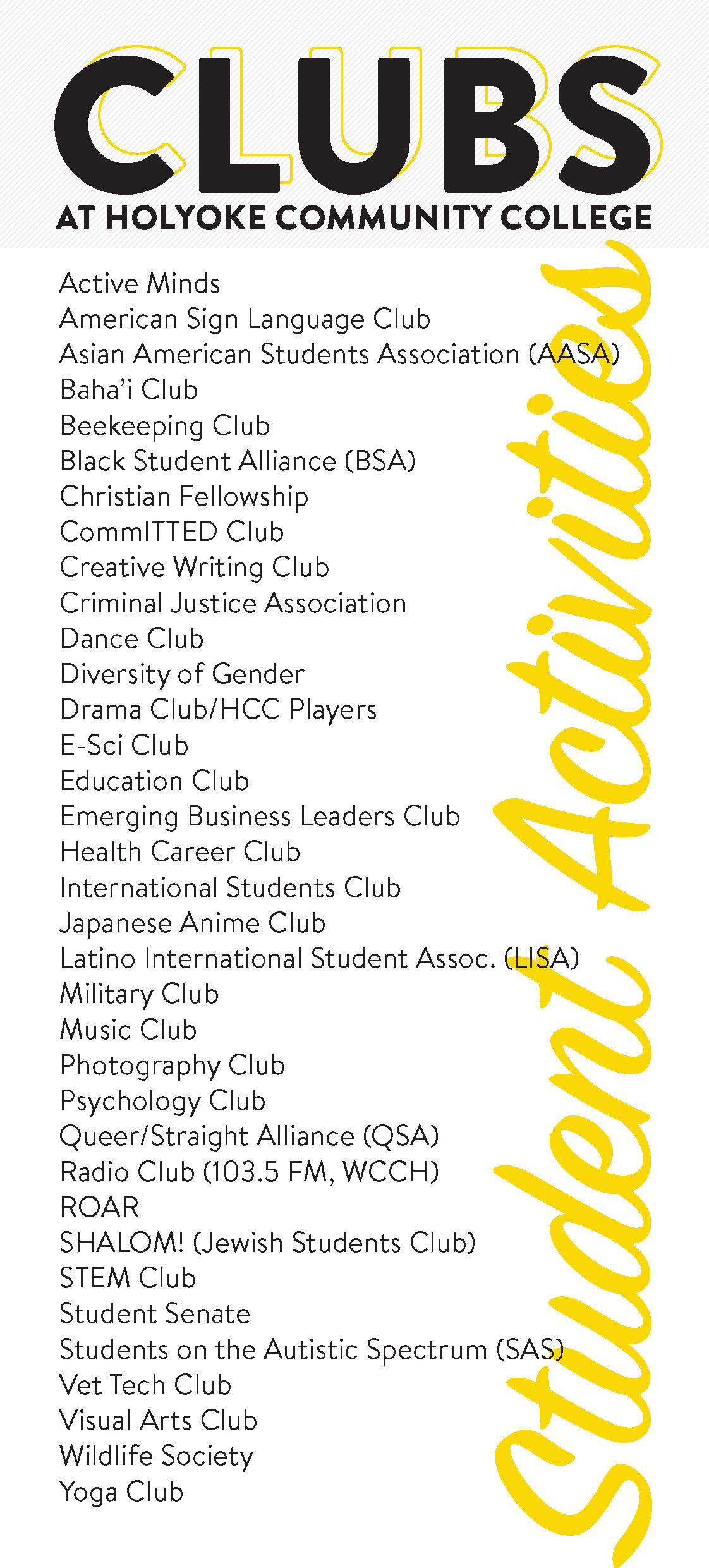

Original design
I was prompted to make a document that could be displayed in reception and handed out as needed. The goal: give students a basic introduction to what clubs were offered and the events they could attend to get involved on campus.
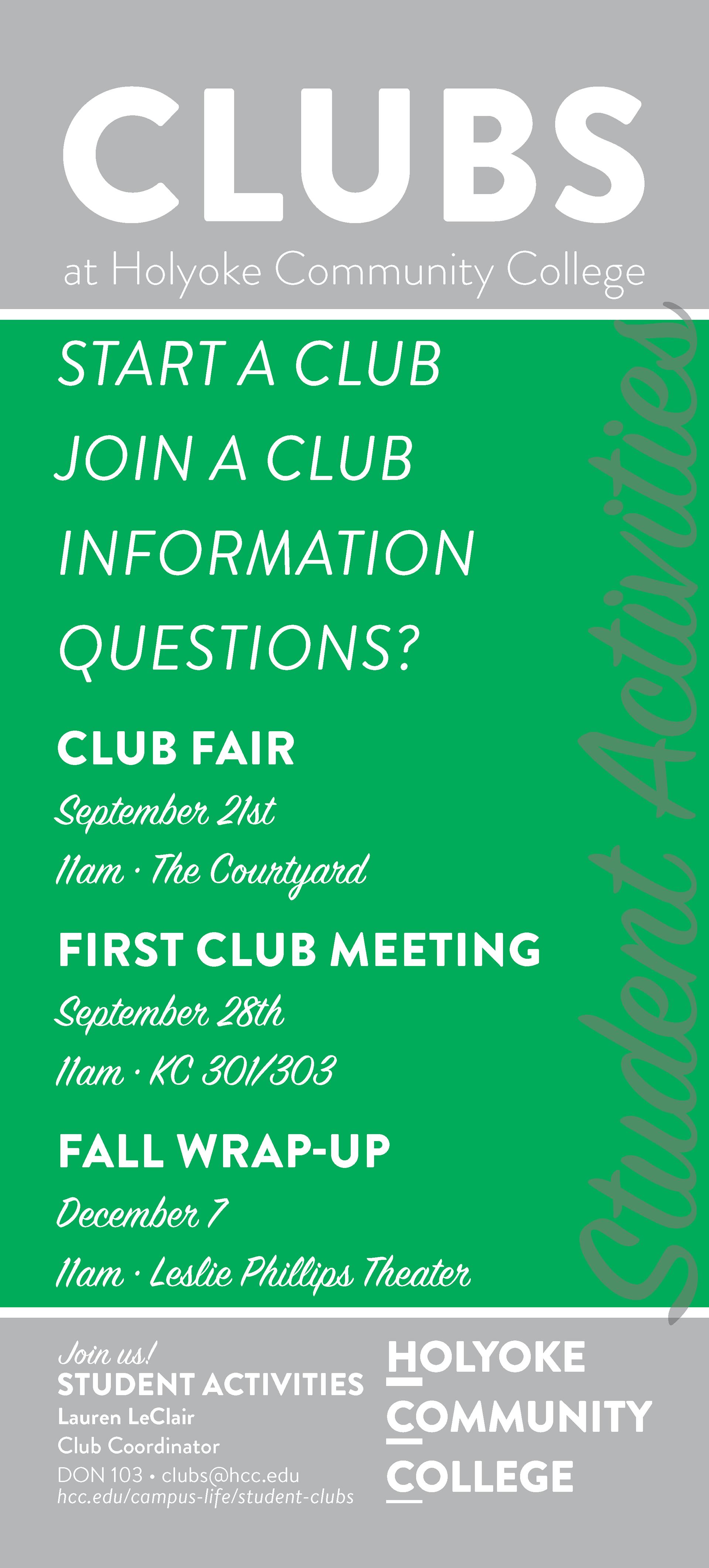
First revision
After using the document and seeing it printed, I found it necessary to make changes for readability and style such as simplifying the type and making efforts to use space more efficiently. I also decided that each year's design should have a different color, to avoid confusion.

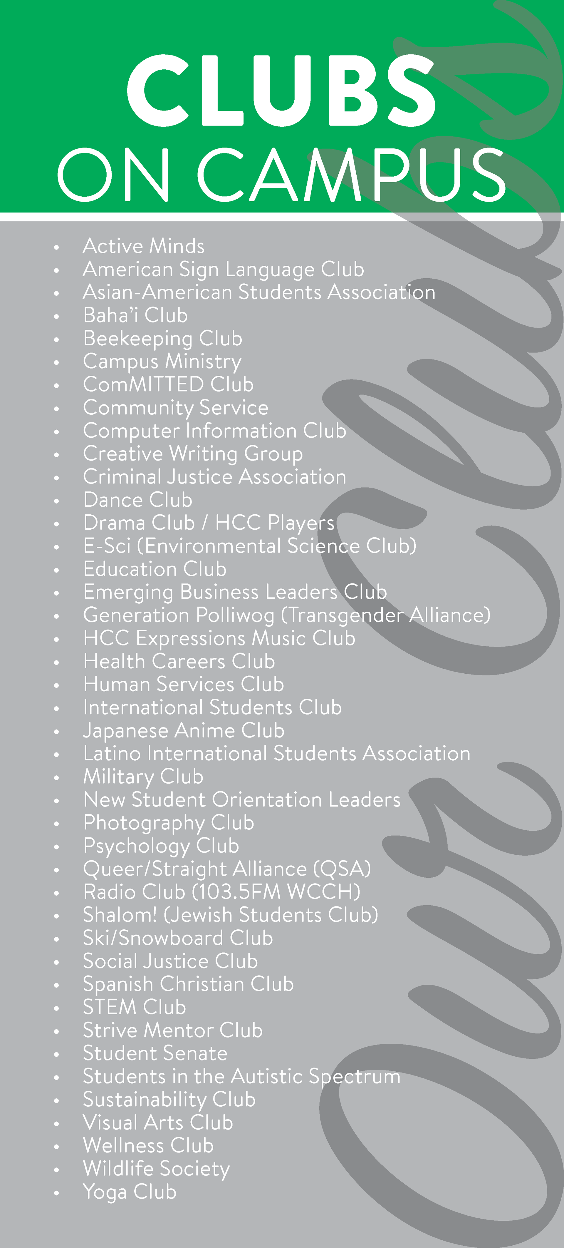
Latest revision
Design was changed from negative space to positive space to increase readability, broaden printing options, and make better use of the yellow color. Typographical hierarchy was revisited again.